Tortuga
Year
2016-20
Role
Art + Design Director
Projects
UX/UI, Brand Identity, Packaging, Art Direction
Fully remote multidisciplinary role. Starting as a designer and developer doing a full brand refresh and an overhaul of the e-commerce experience. My role grew to include art direction for local and global based photography projects. As well as directing all design and web development projects with small freelance teams, though, usually doing everything myself. Partnering with leadership and marketing, I designed a decision making flow that simplified complex product purchase decisions to a few binary decisions. Instead of customers having to pour over specs.
Role
Design Director
Project
E commerce UX
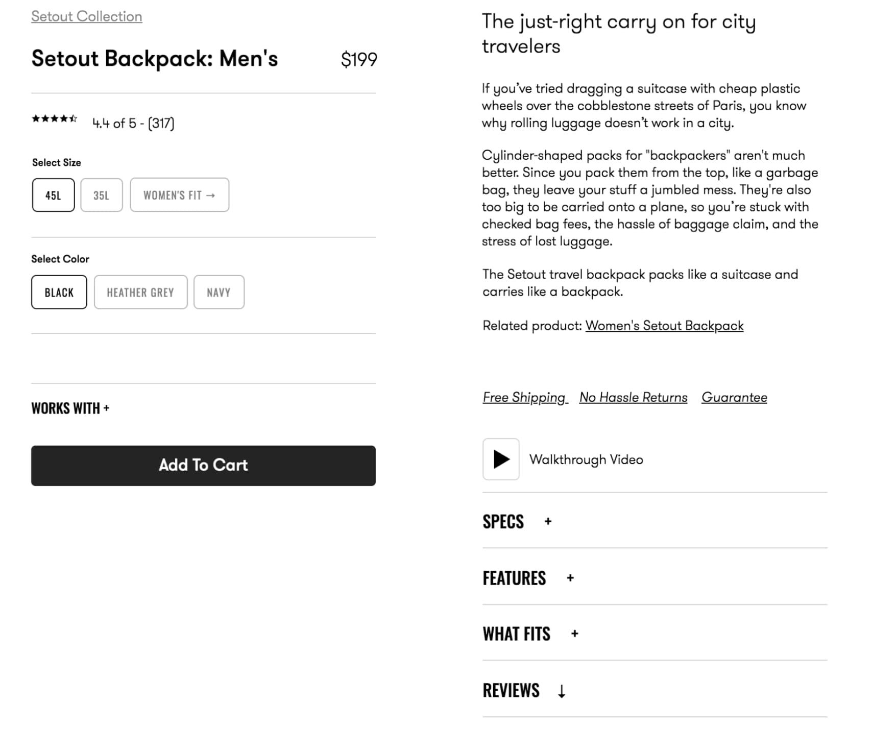
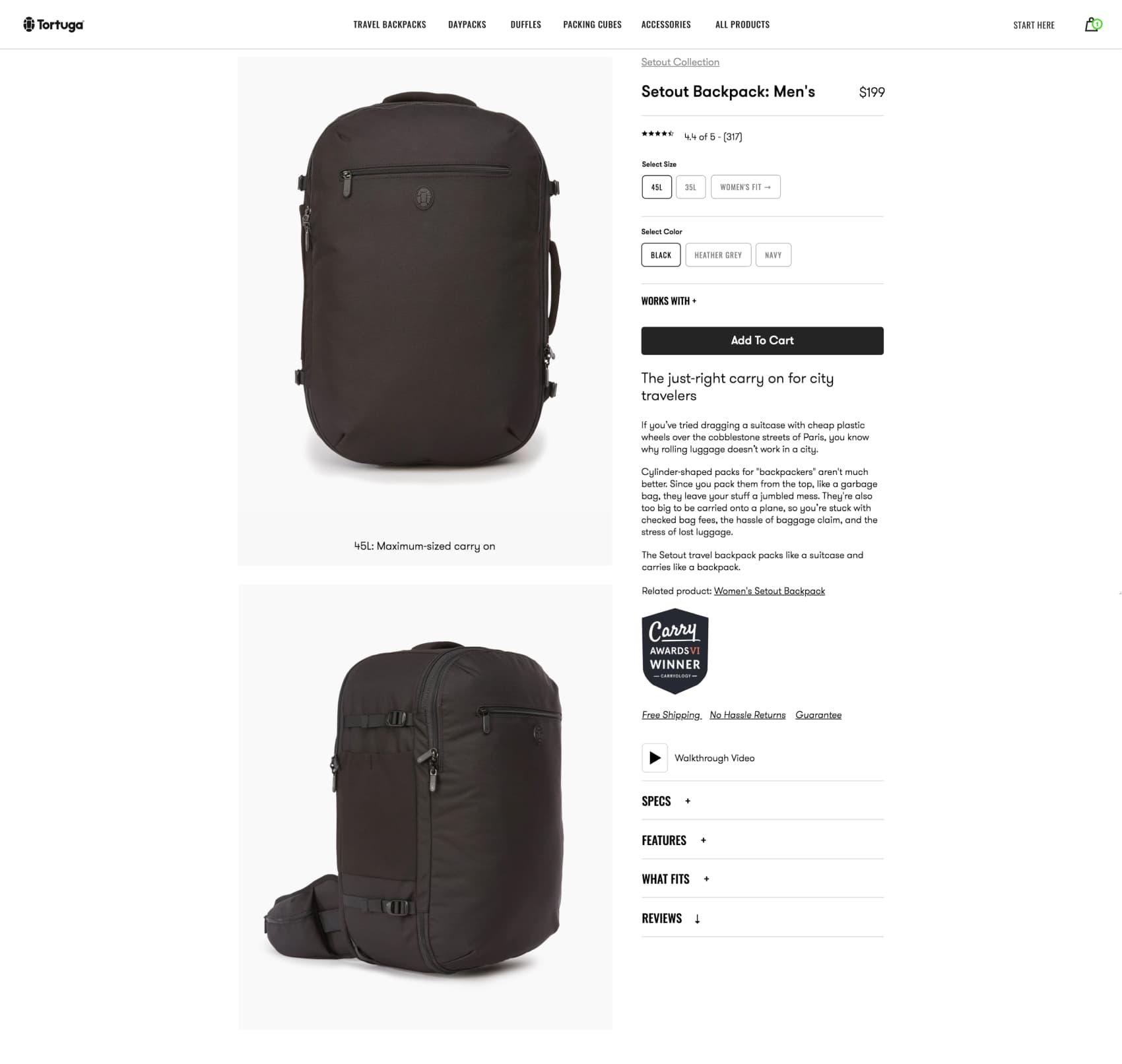
Problem →
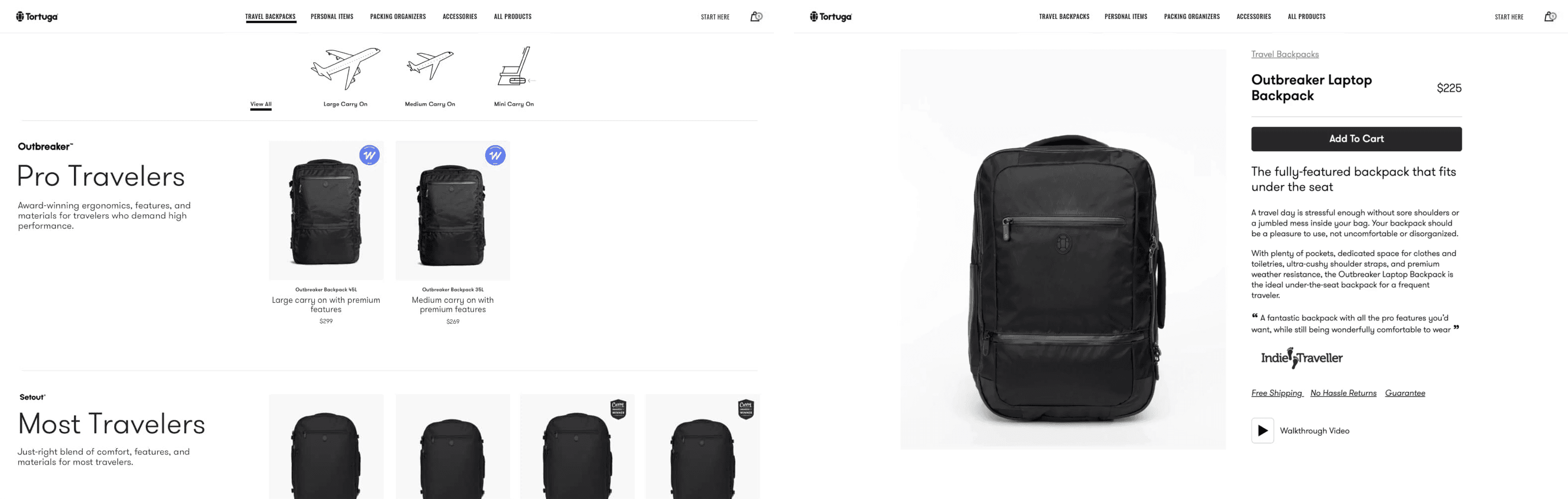
As Tortuga’s product offering grew, the decision making flow to find the right backpack was complex. Often resulting in multi-tab browsing to pour over technical product specs and page exits.
Solution →
Simplify the flow to a series of just a few decisions, as the user navigates the shop. Ending on a product page in high confidence it’s the right backpack for them.
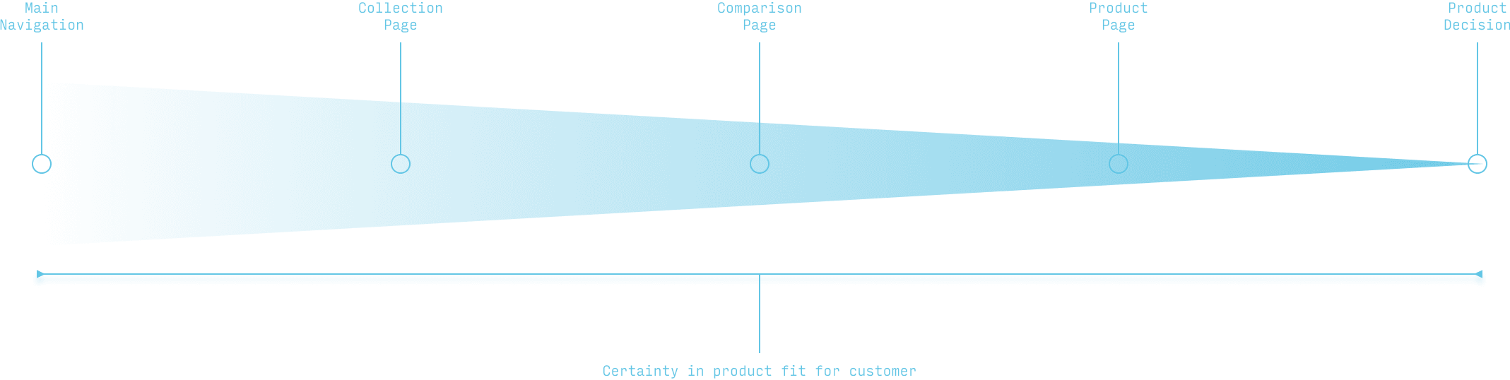
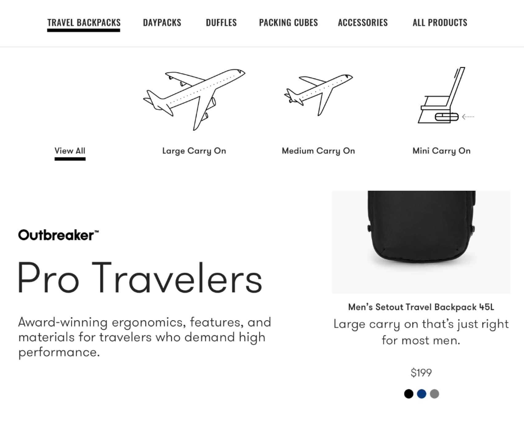
Decision Flow Step 1 →
Familiar categories used for navigation as the entry point into the decision flow from any page on the shop.

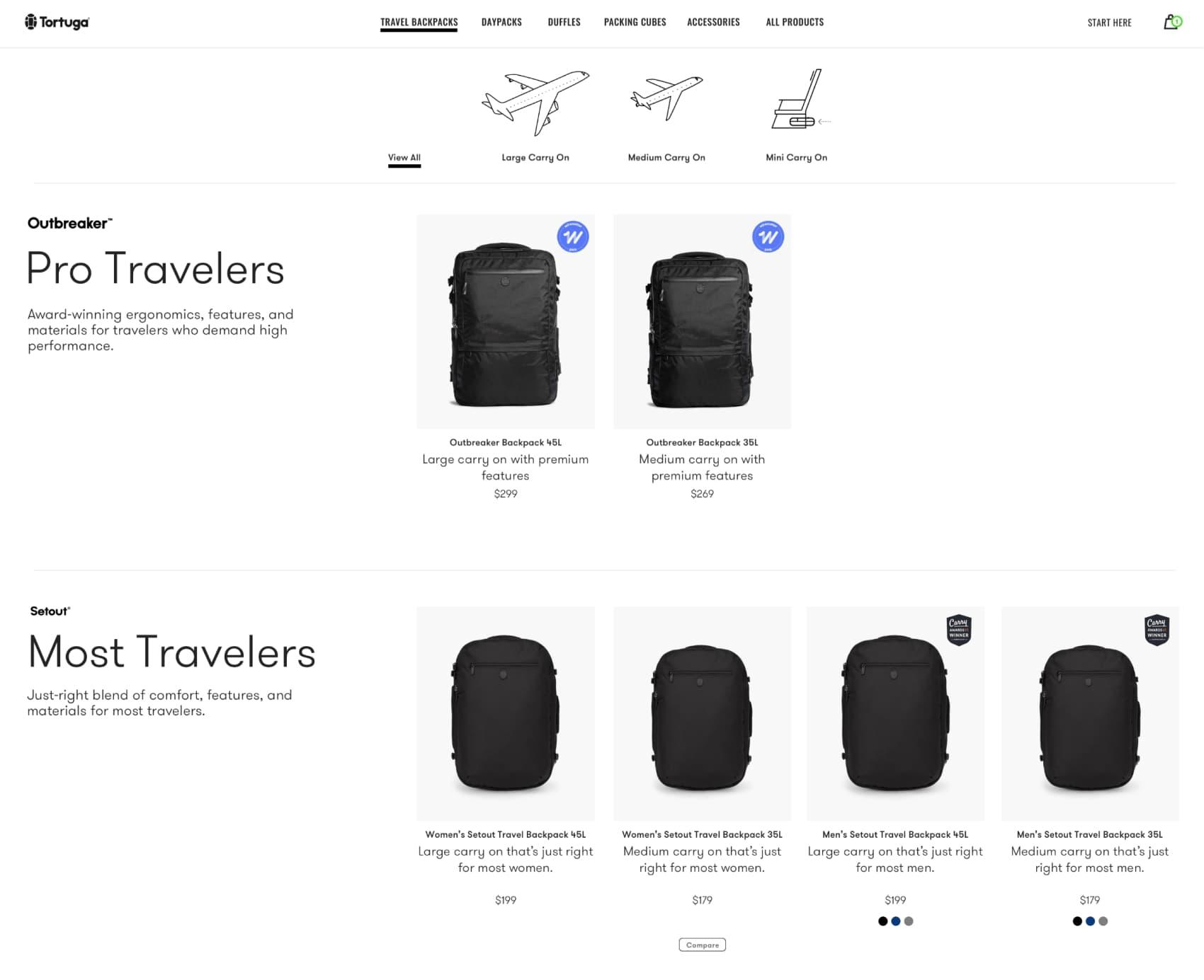
Decision Flow Step 2 →
1. Filtering contextualize Tortuga’s product categories further within travel use cases. 2. Product lines and individual products utilize one liner descriptions to further narrow products down.
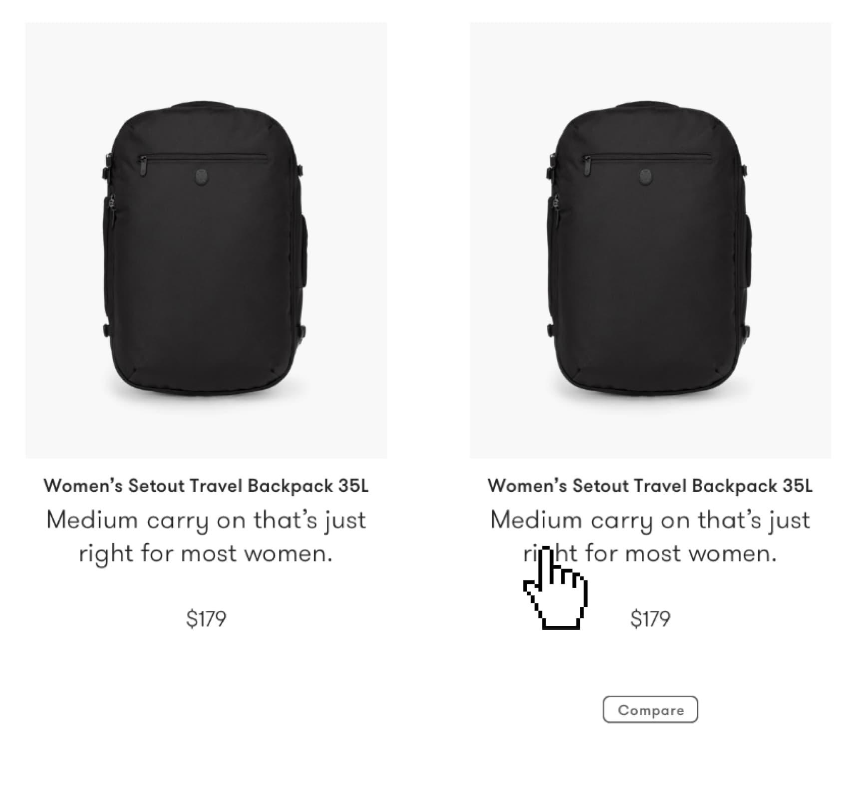
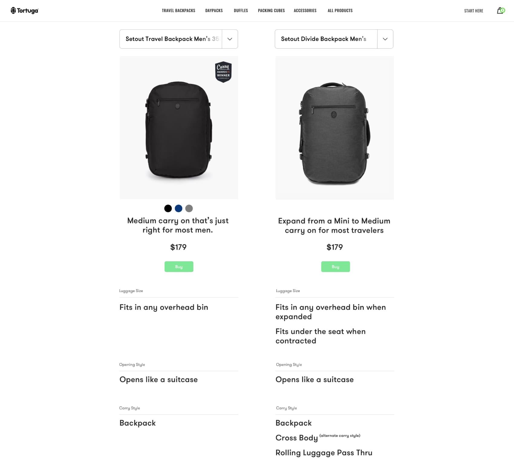
Decision Flow Step 3 →
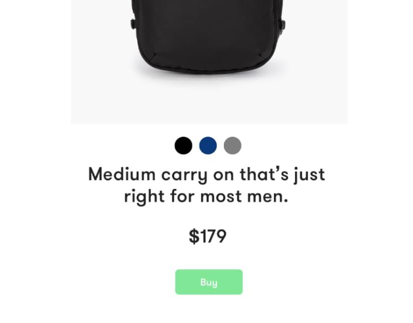
1. Most customers had a few products they wanted to compare. So we created a comparison tool and tested where it was most expected by customers. The collection pages. 2. We simplified the comparison process by using conversational specs in travel contexts.
Decision Flow Step 4 →
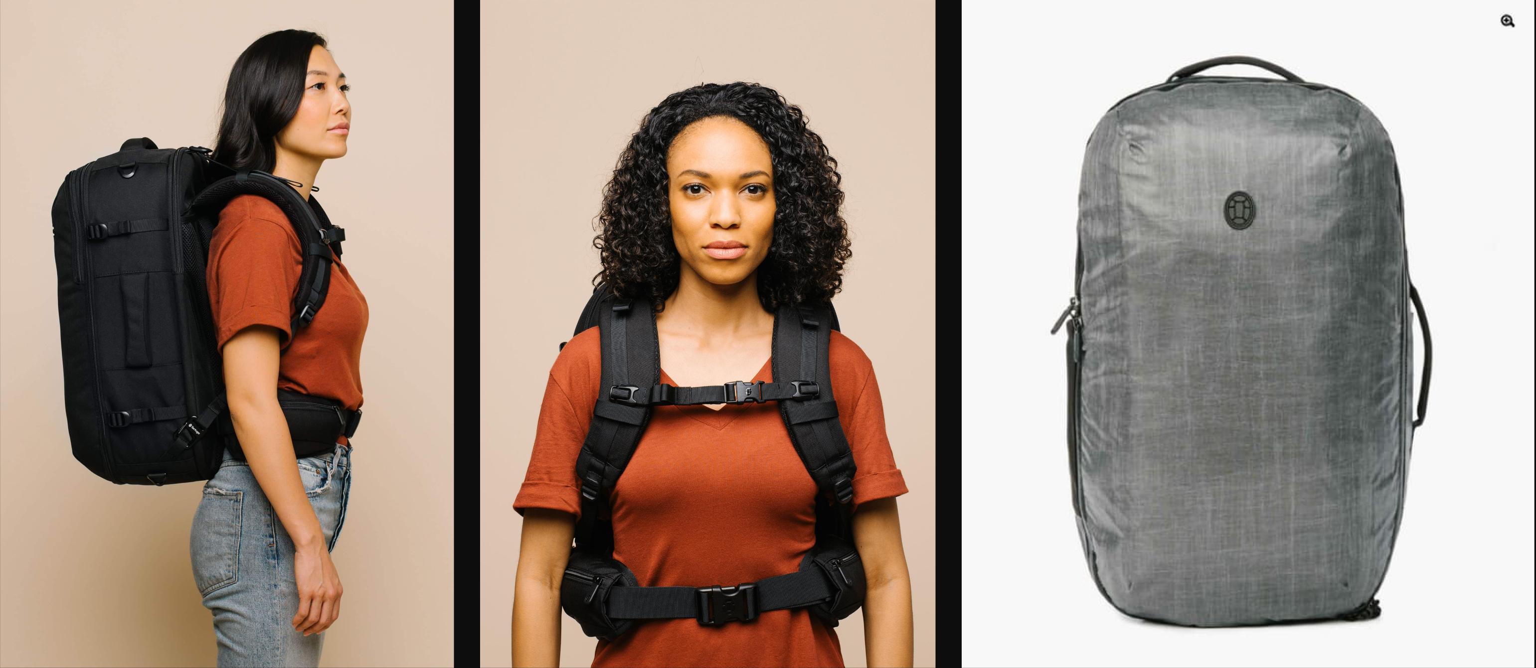
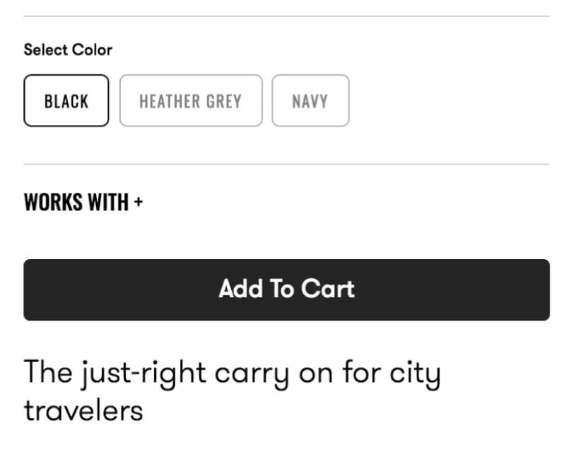
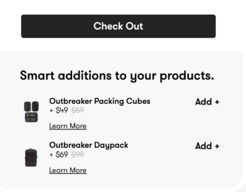
1. Product pages provide copious details with a mix conversational and technical descriptions. Technical details were always one interaction away behind respective detail section headers. 2. We also created a right time “works with” feature to suggest popular add on products for a given piece of luggage. These are one interaction away near the “add to cart” button.
Decision Flow Step 5 →
1. Products were most often added from the cart, but a user behavior existed where they would navigate to the compare page before purchasing. With this insight, we added a “buy” button for each product on the comparison page. 2. The “works with” feature was added to the cart as a “right time” location as well.
Year
2016–20
Role
Design Director
Project
UX/UI, Development
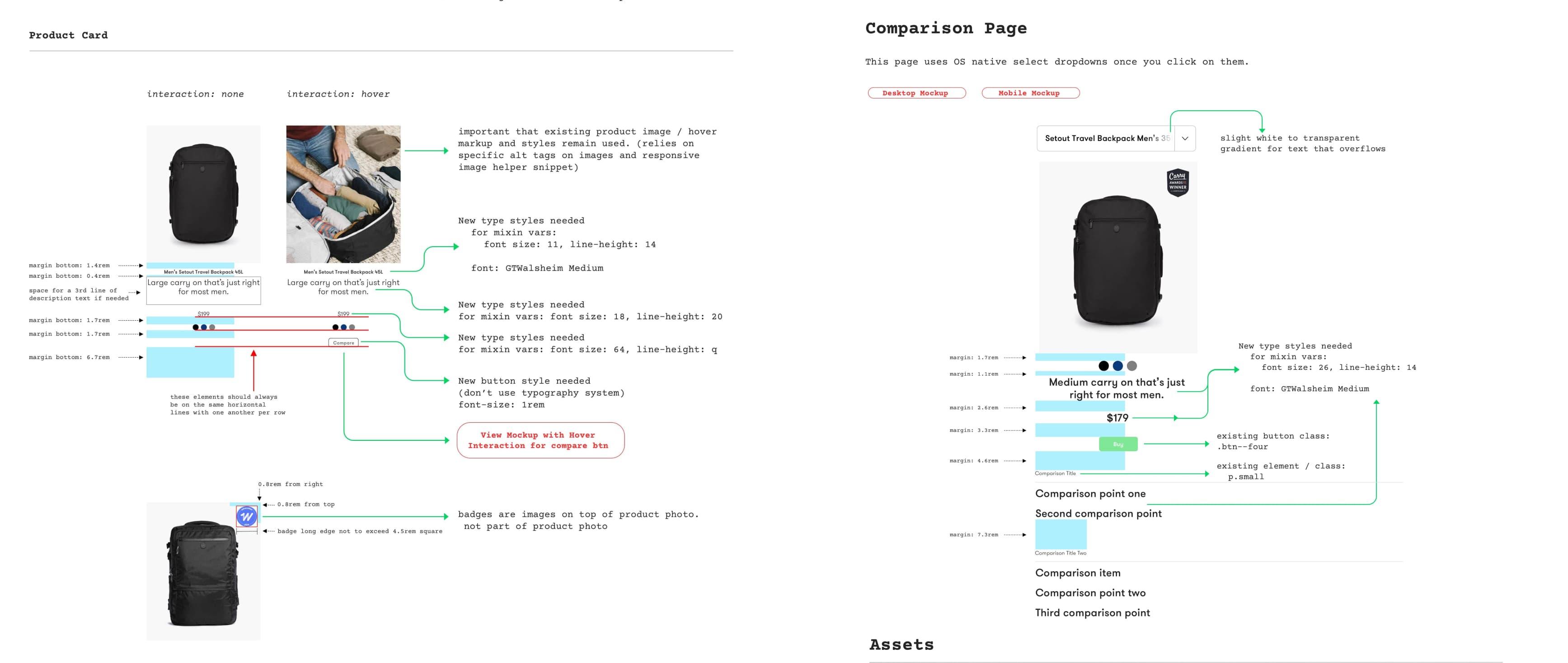
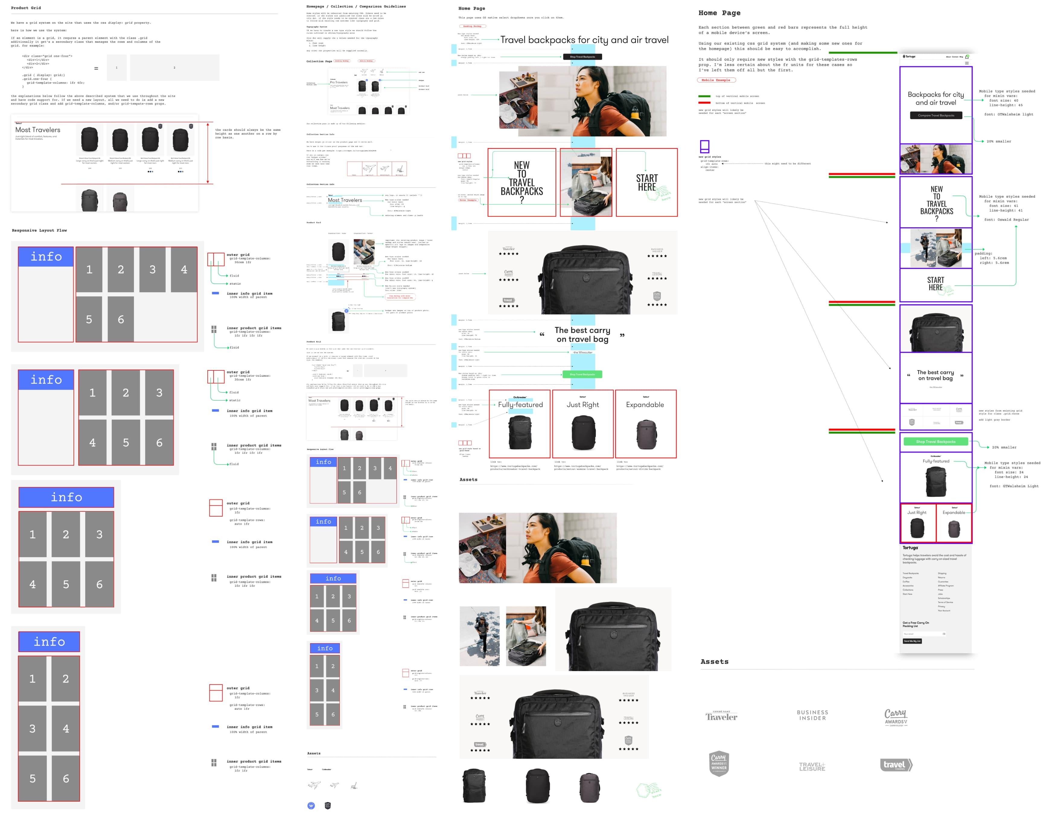
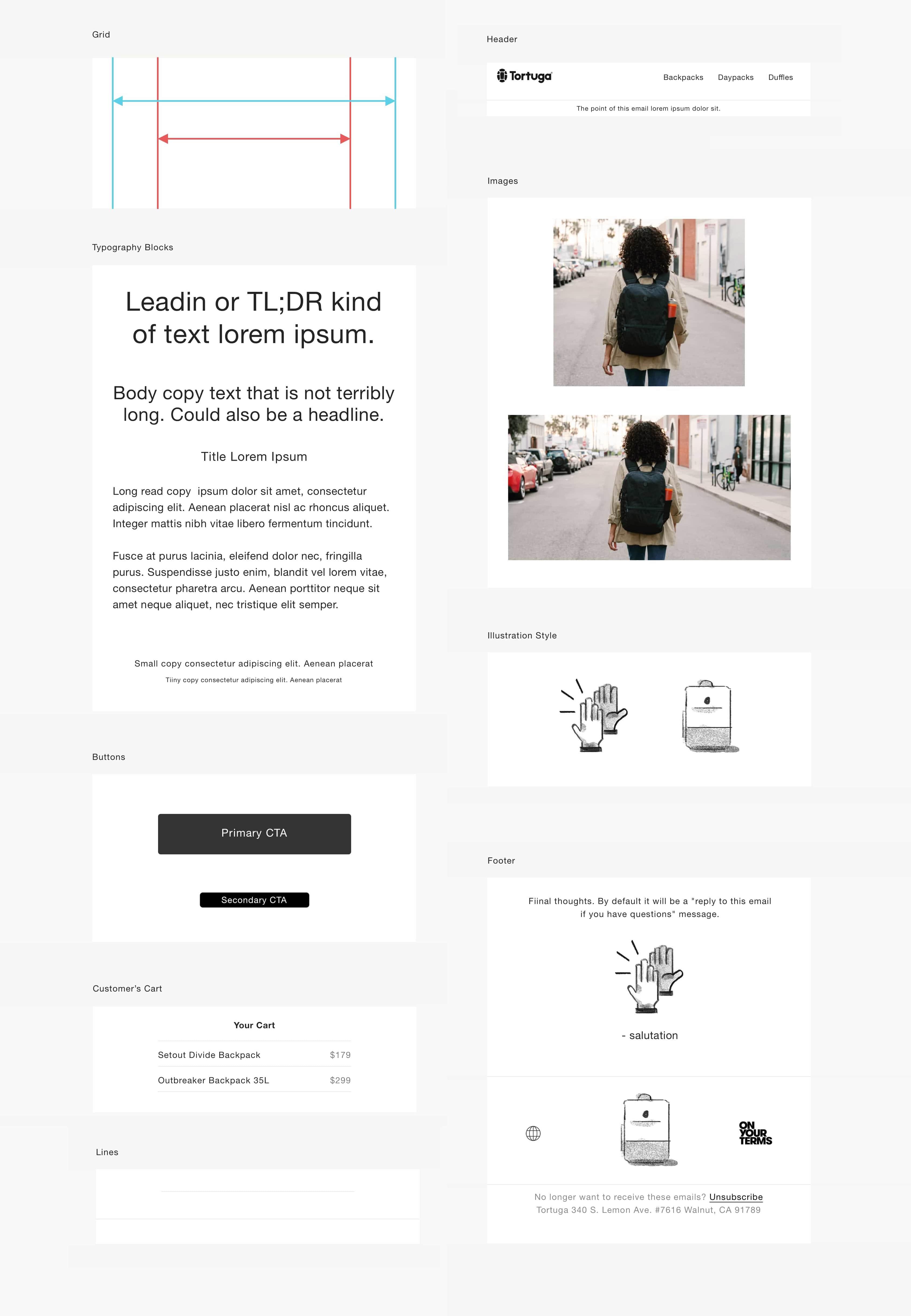
1. Visual and design systems were created so typography values from sketch app could be used in a SASS mixin for parity with typography in the visual design system, and front end style guide. 2. Every feature and component in the design system was designed mobile first, and responsive. When working with contract developers, detailed UX specs were given that explain where proposed designs utilize existing design components and systems, and when new expansions were needed.
Year
2016-20
Role
Art + Design Director
Project
Brand Identity, Graphic Design, Web Design, Art Direction, Illustration
Context →
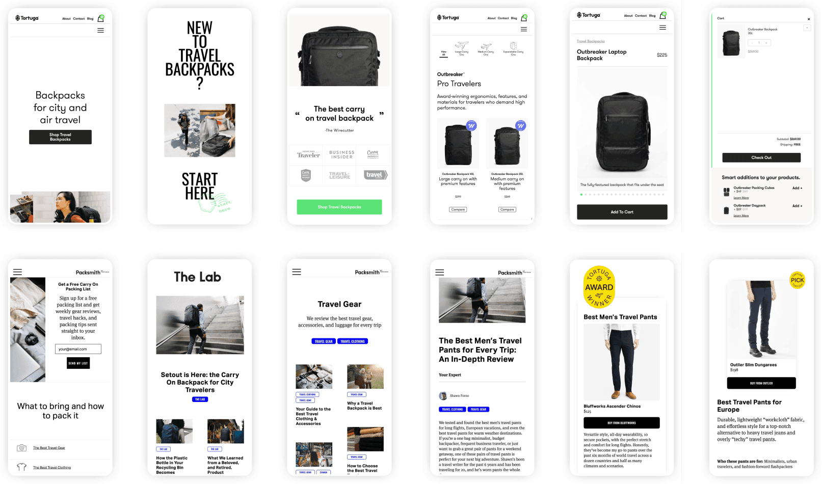
Once the initial e commerce experience was refreshed, we had several smaller feature improvements, or new feature needs per quarter. All web projects were approached with a combination of lean and agile UX. Starting with a goal I would begin the UX design process to find the best way to achieve the goal through texting and iteration. Taking customer and business needs into account.
Cross department collaboration was the norm. Sometimes I managed a small team of freelancers for web development, though I was most often the front and back end engineer.
For each project we conceived and implemented anonymous user behavior measurements to guage the effectiveness of given solutions. Regularly analyzing the data to find opportunities for continual improvement. Each feature and iteration had measured improvements.
Context →
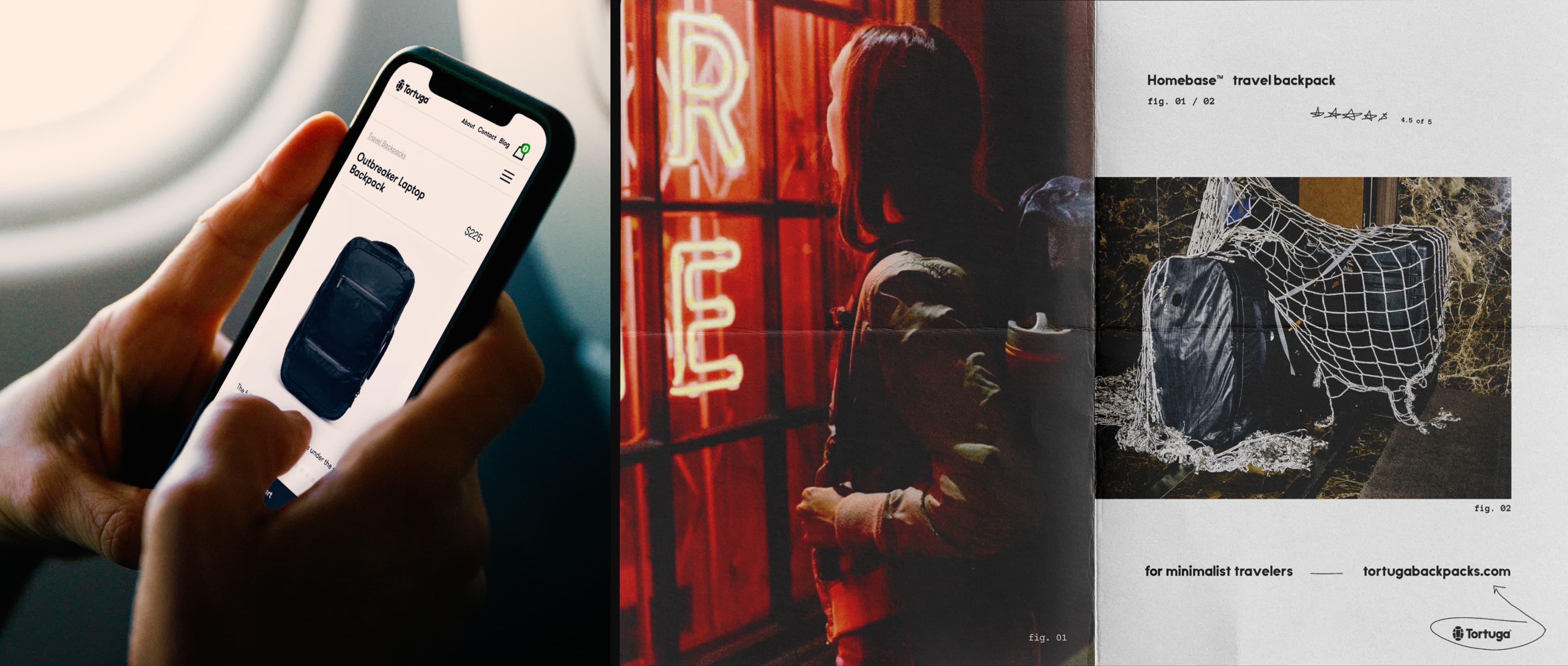
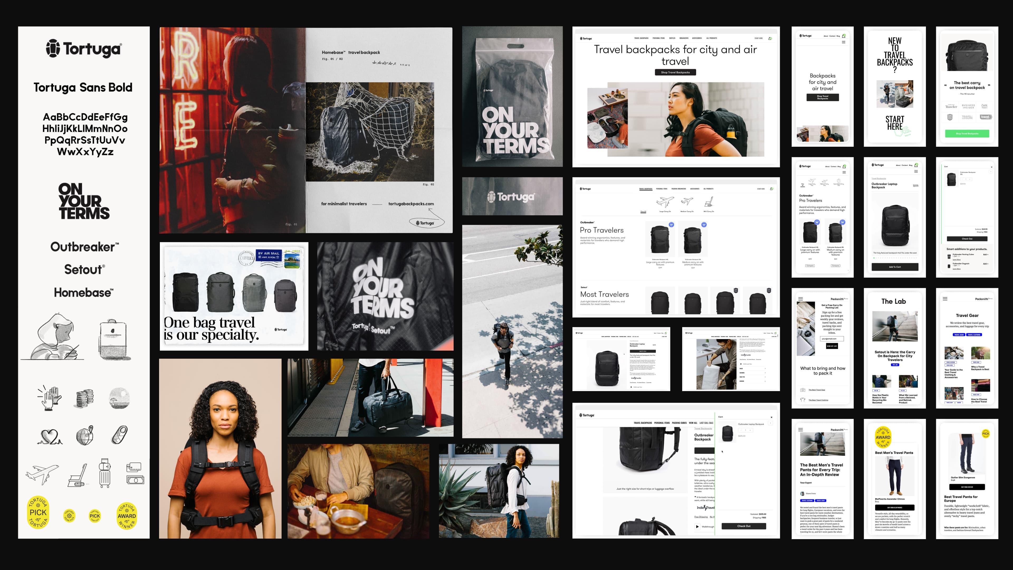
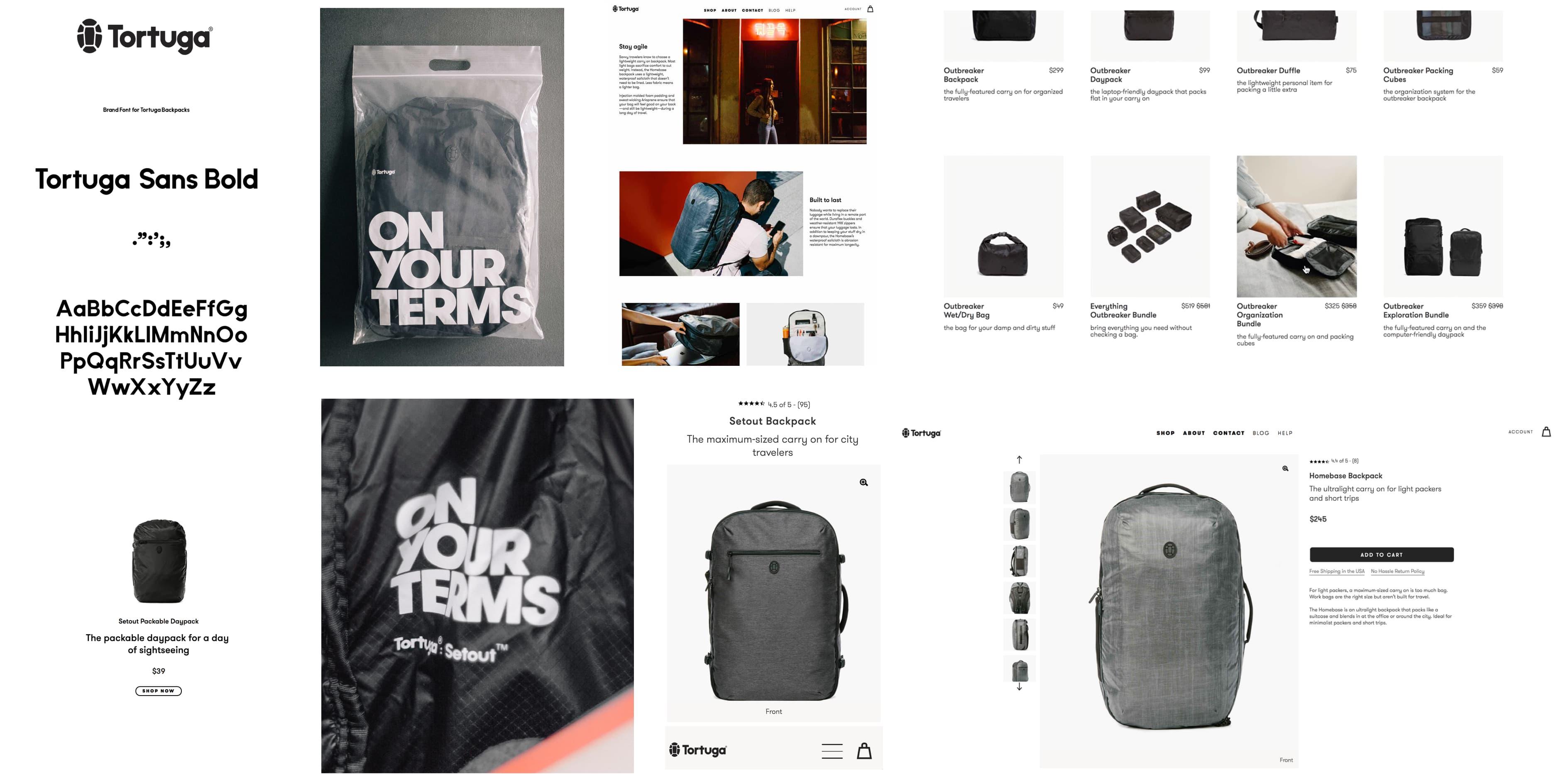
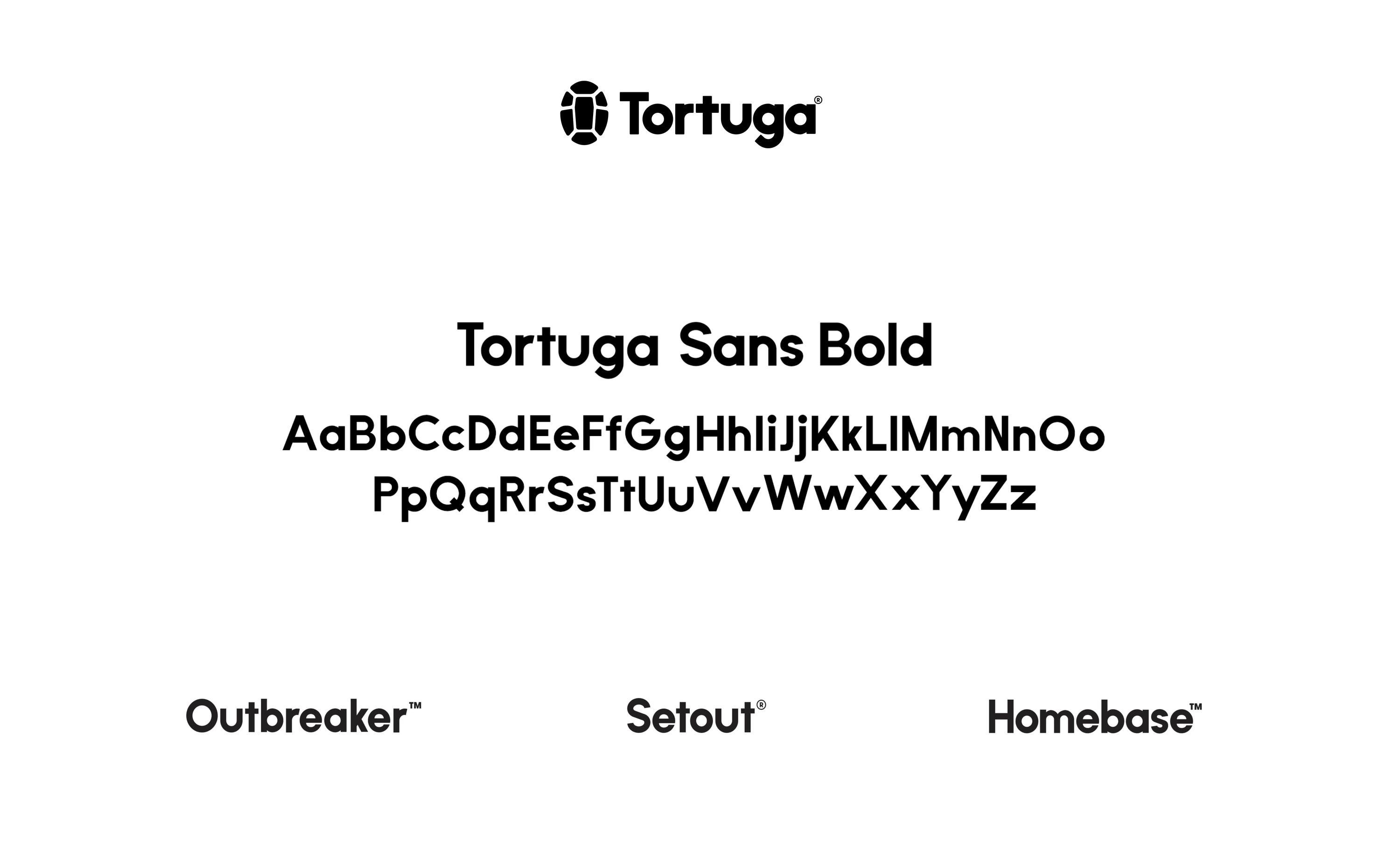
The identity redesign preserves what Tortuga had been, and embraced where they were headed. Iterating, not replacing. I was responsible for and executed all of it.
These key words bubbled up as most relevant for the redesign:
Confidence, Relatable, Human
Important aspects of the new brand were:
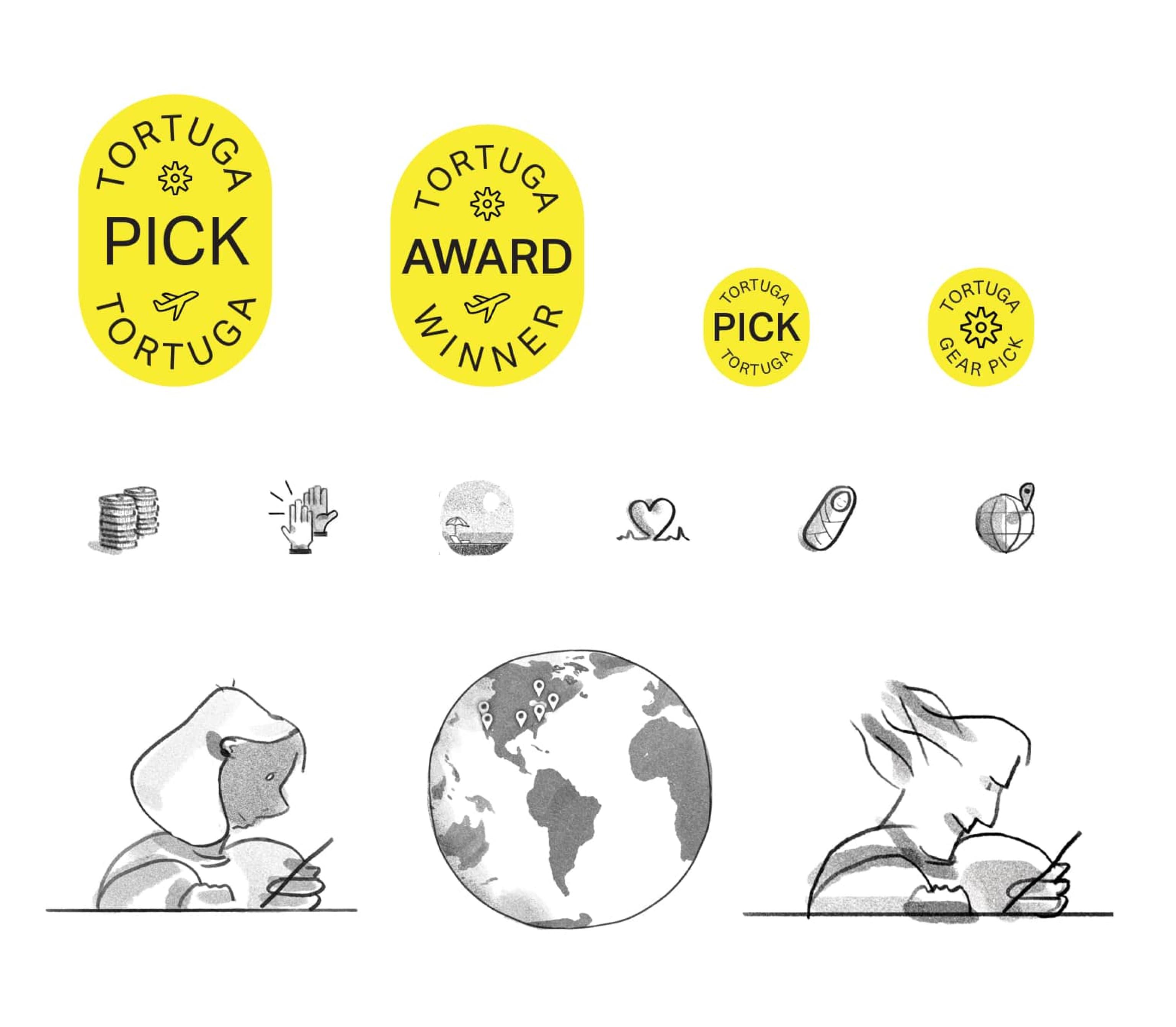
custom font, new logo, new art direction, and illustration.
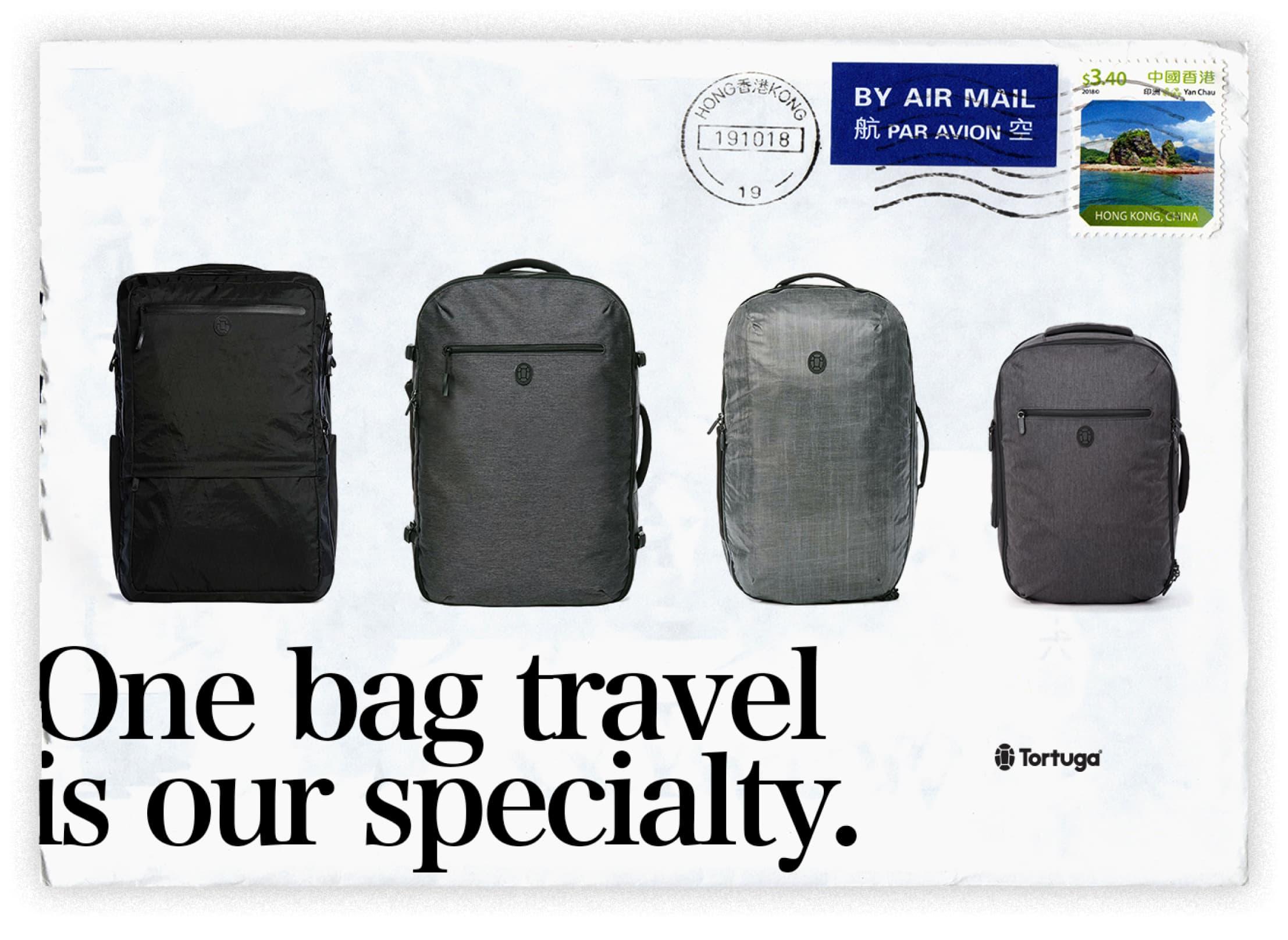
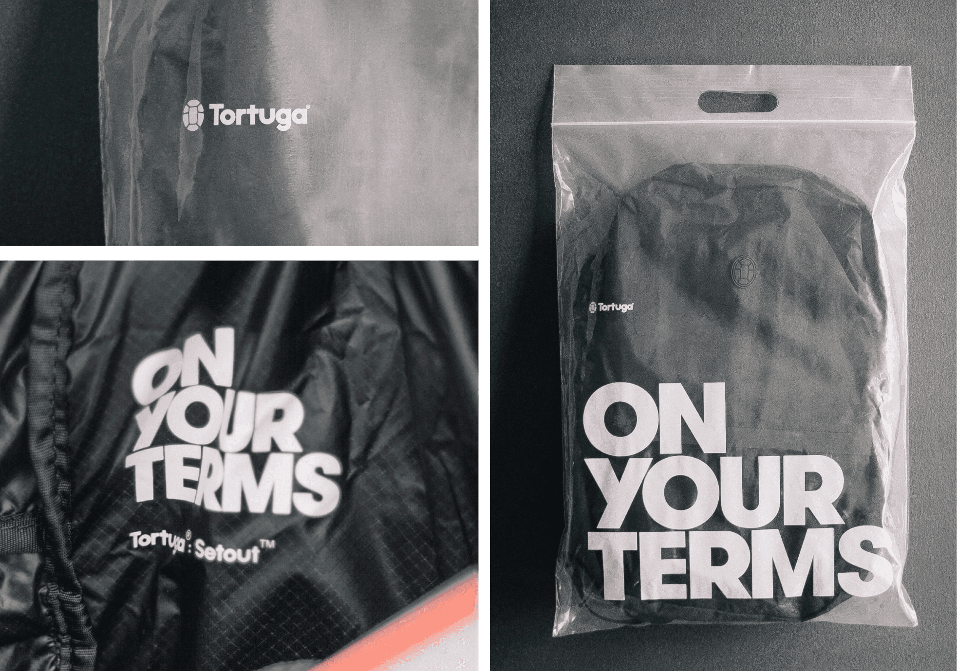
We created a system for implementing this brand for multi-channel marketing needs, and digital and physical deliverables like; packaging, printed colateral photo and video content, website design, and last but not least, business cards.
![]()
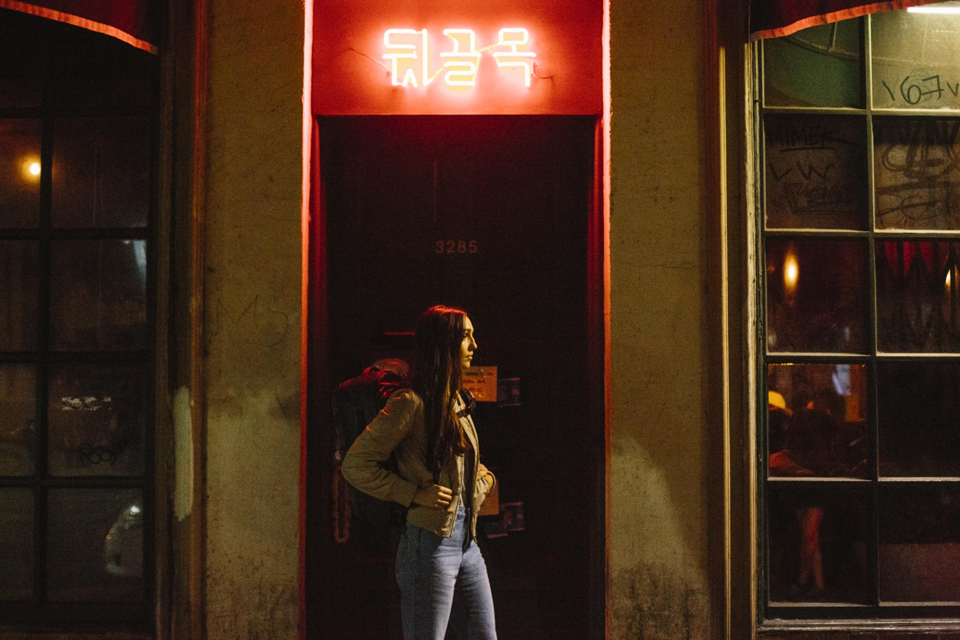
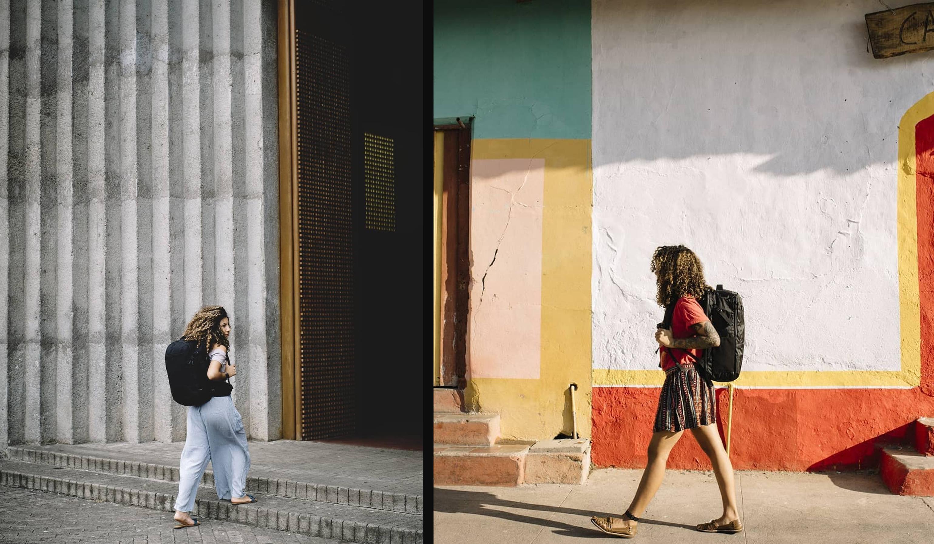
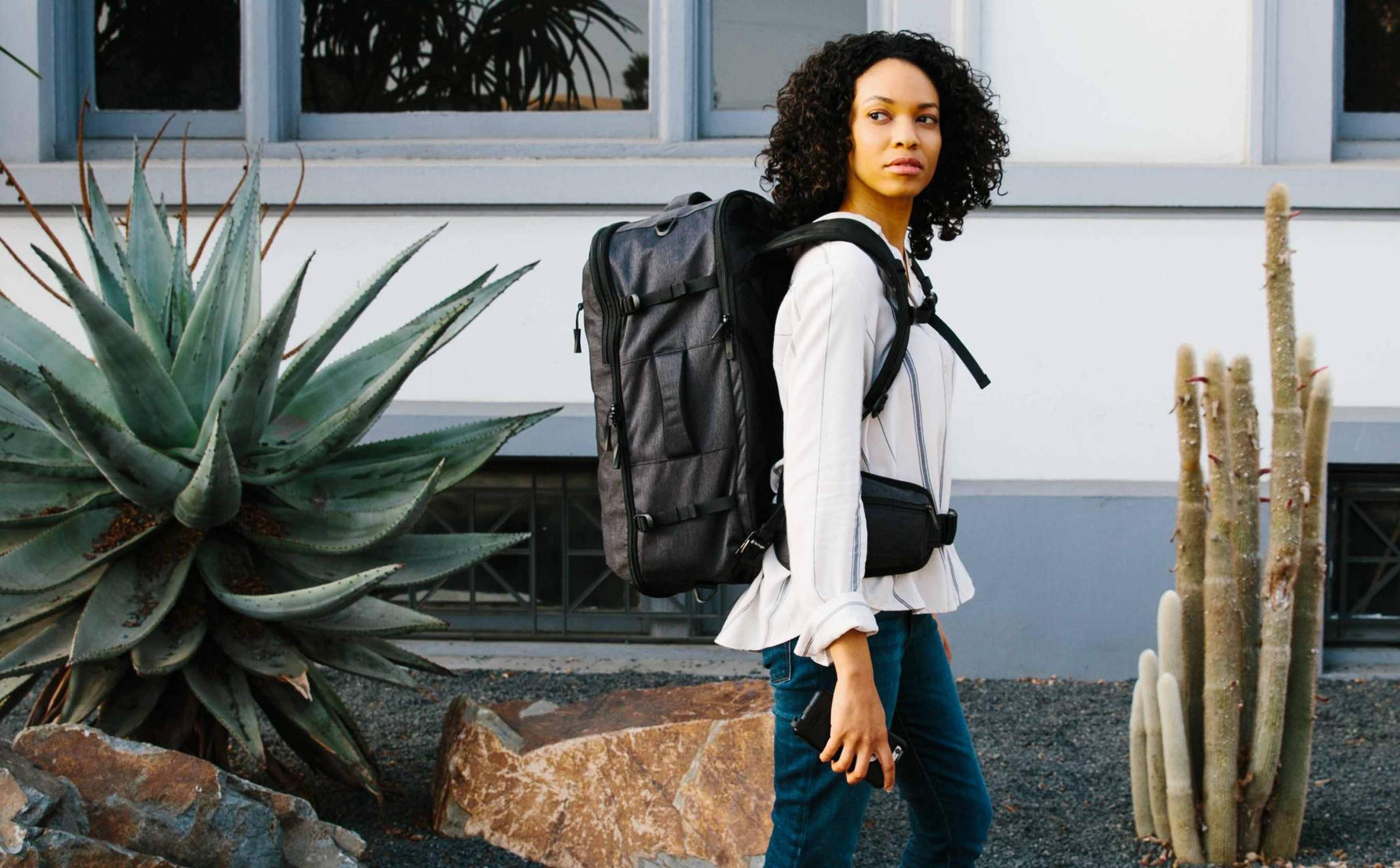
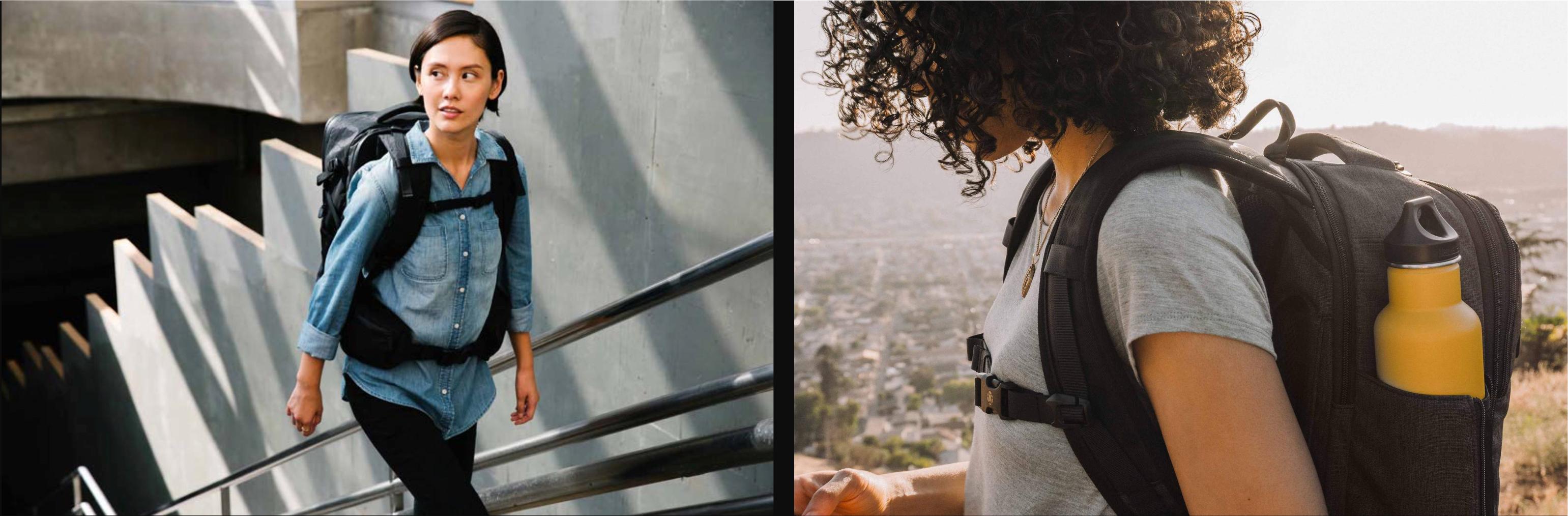
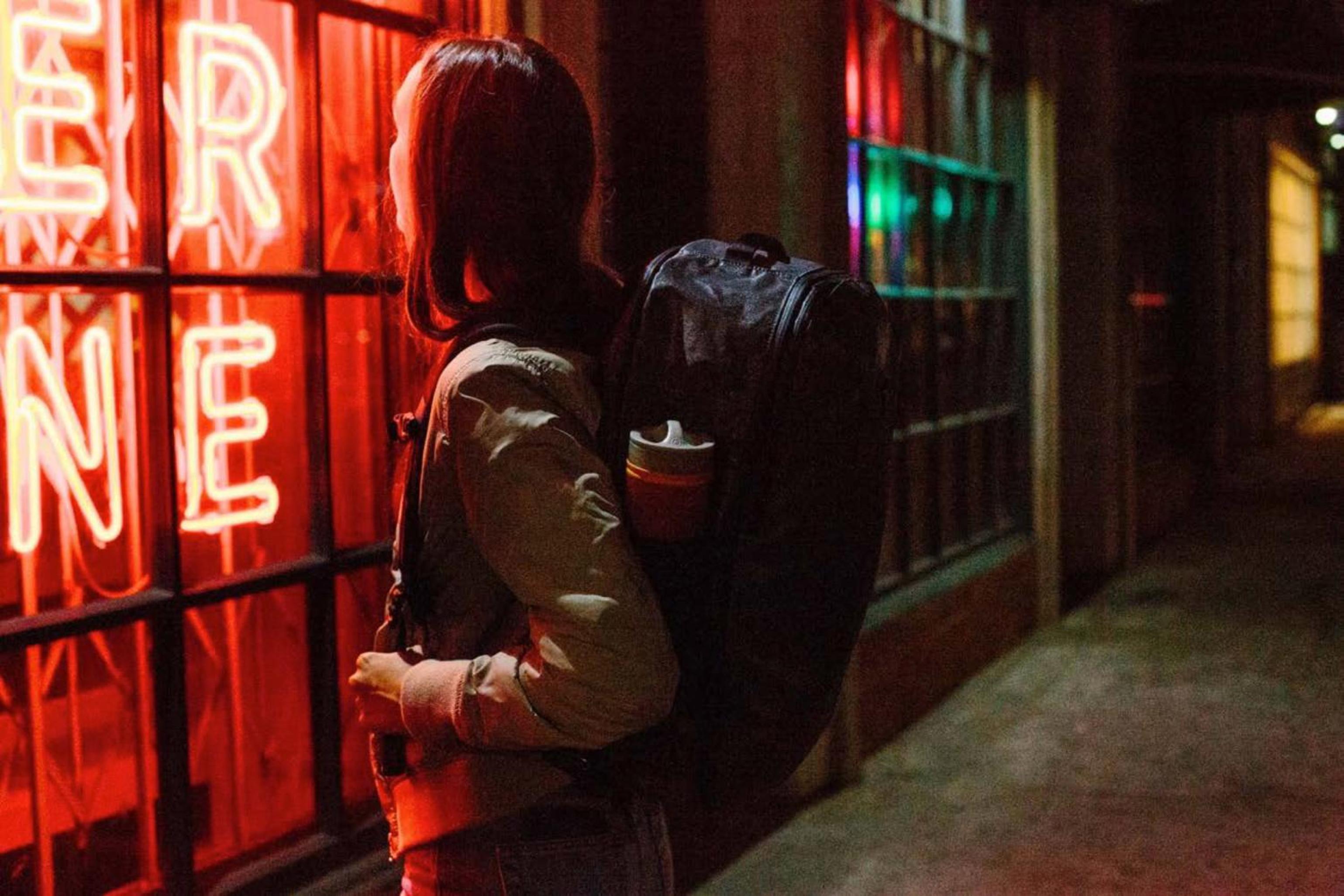
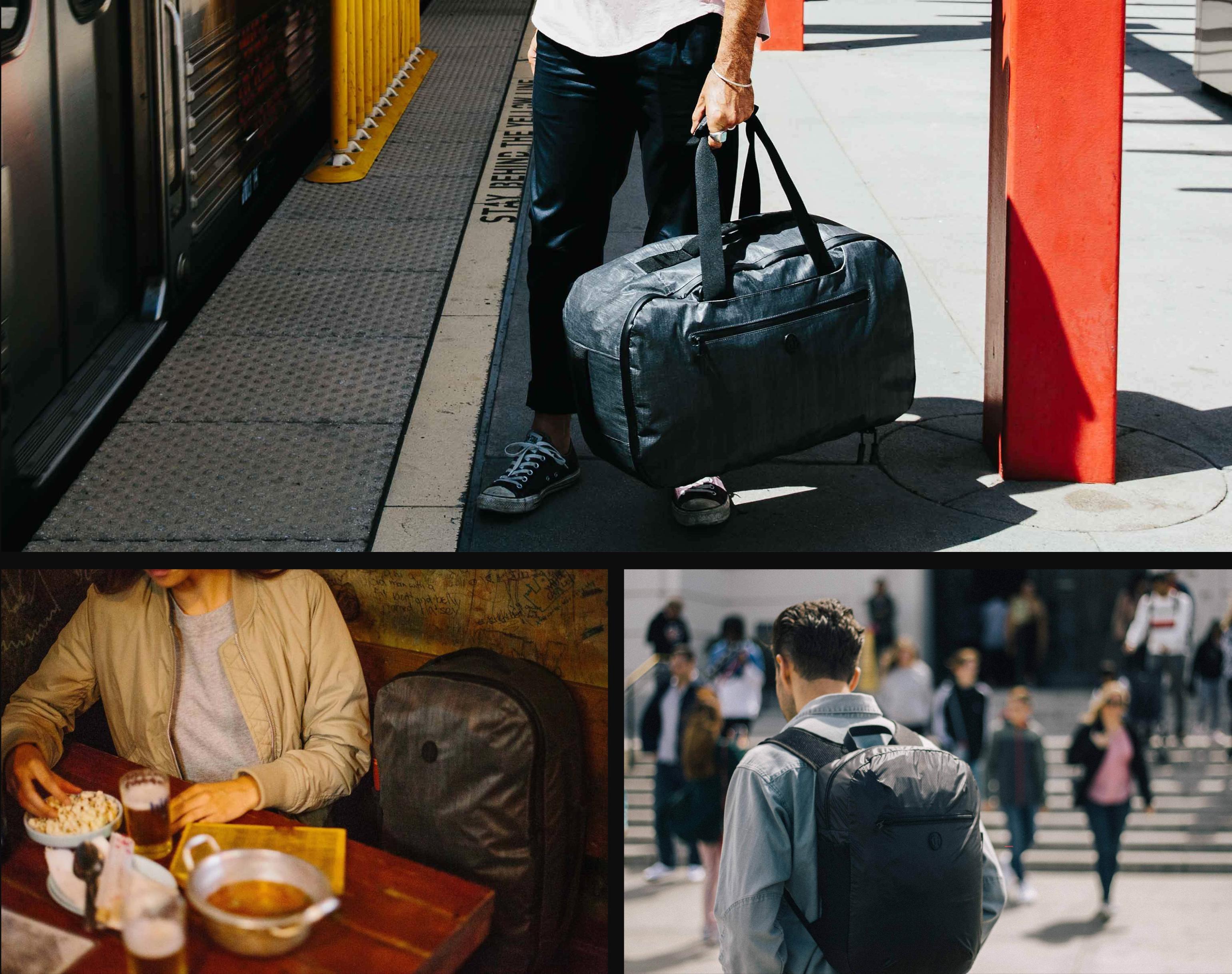
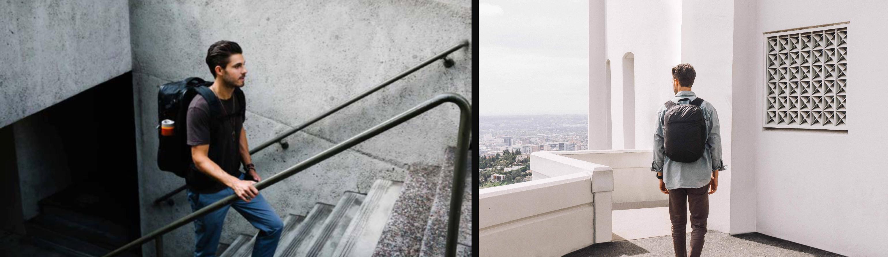
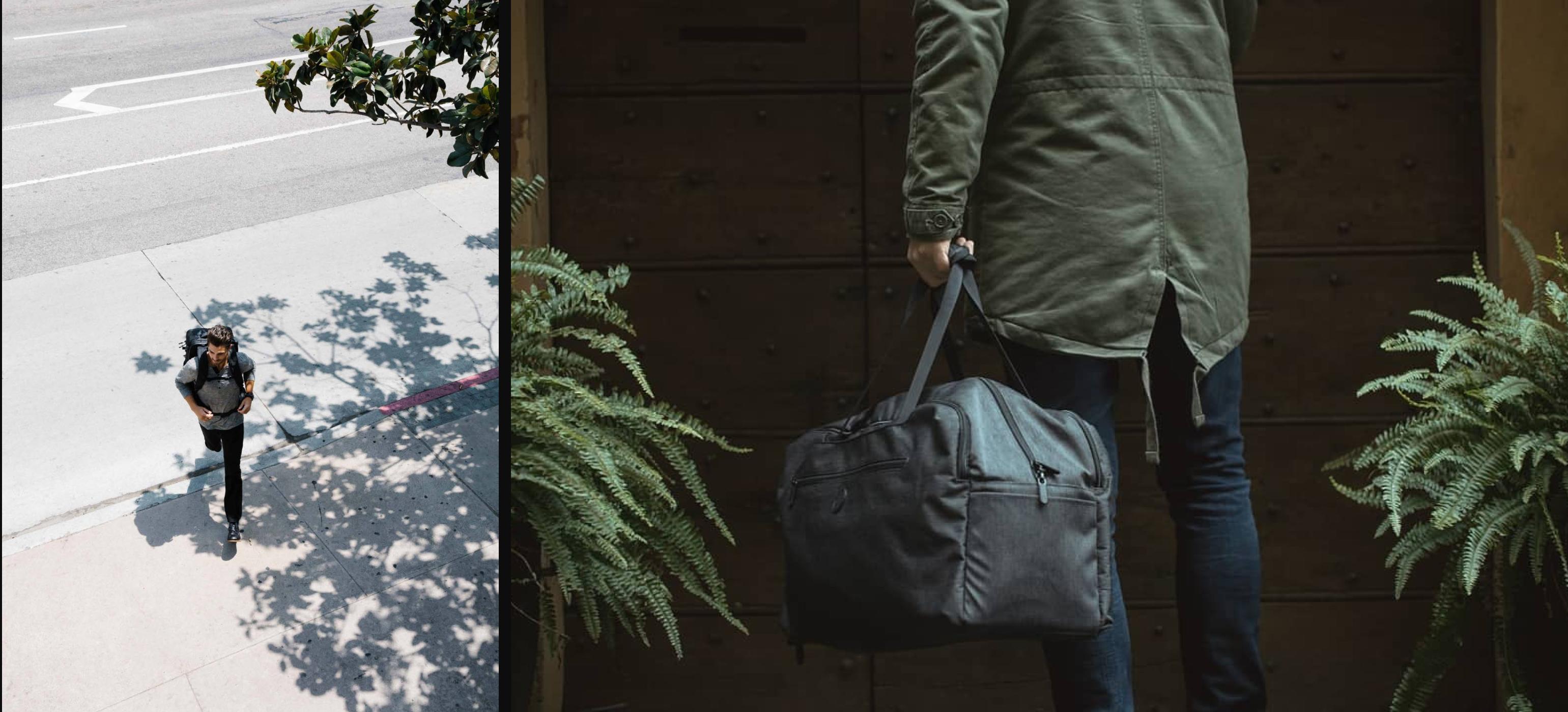
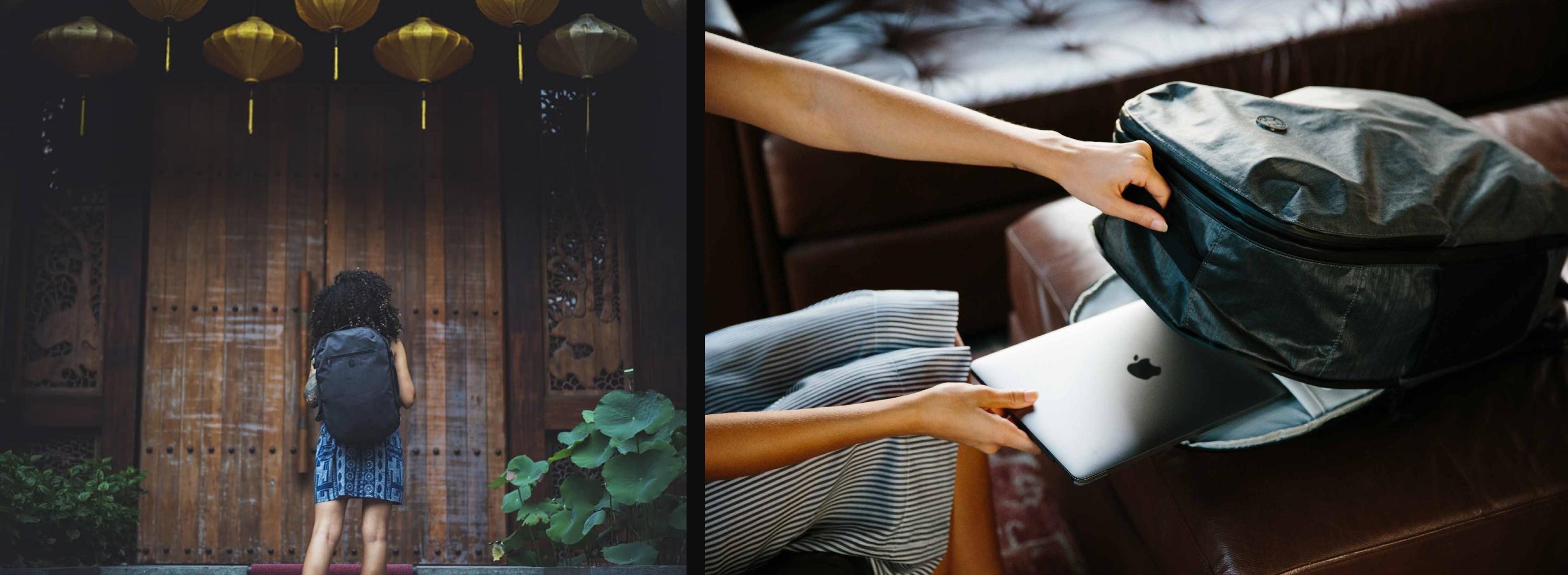
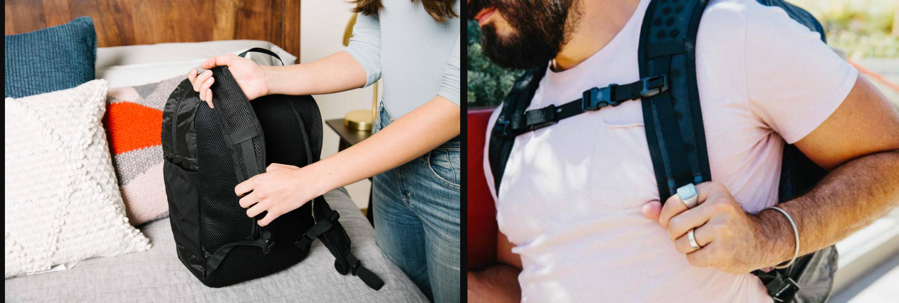
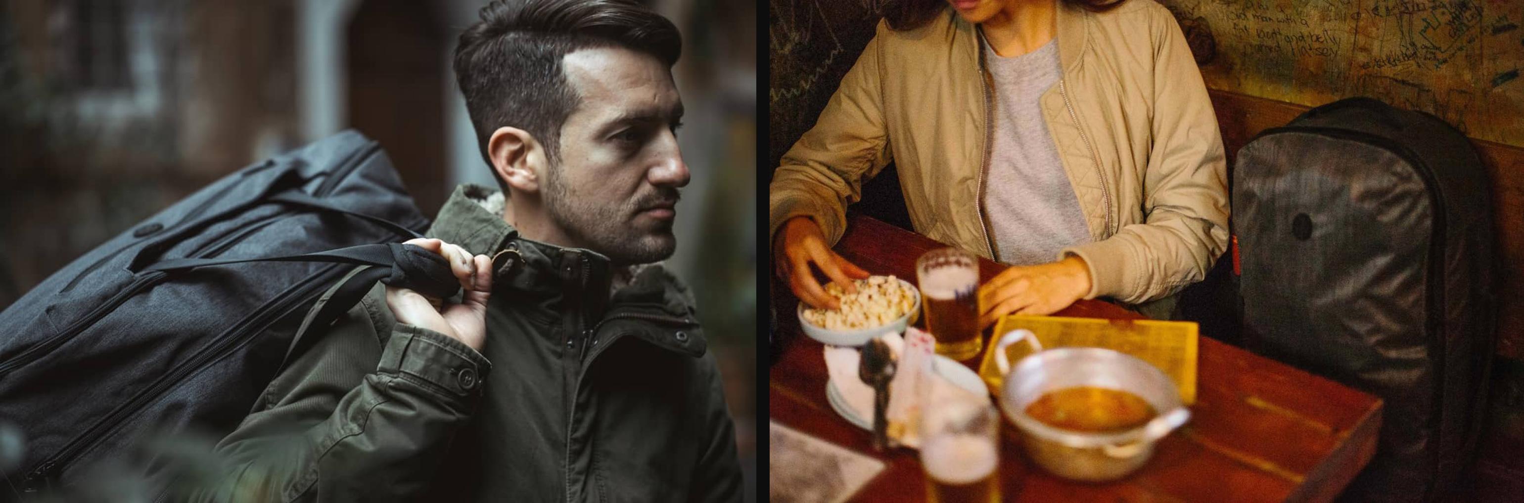
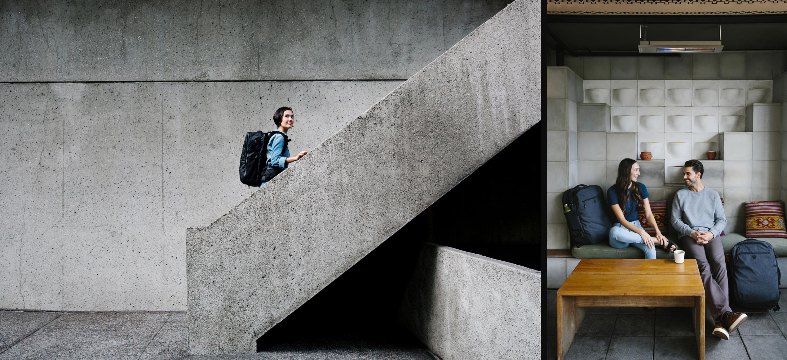
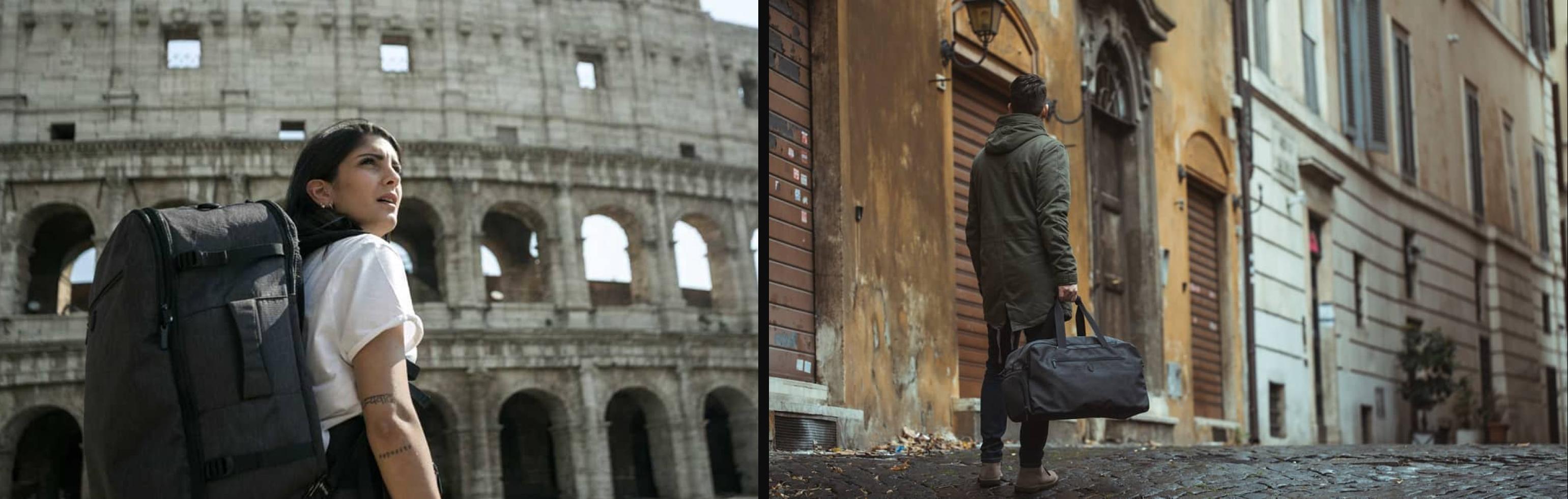
Context →
Created a brand centric stock photo library where most photos contained products in use.
Working with editorial and marketing so their content needs were met, I created monthly briefs that aligned with several photographer's travel schgedules.